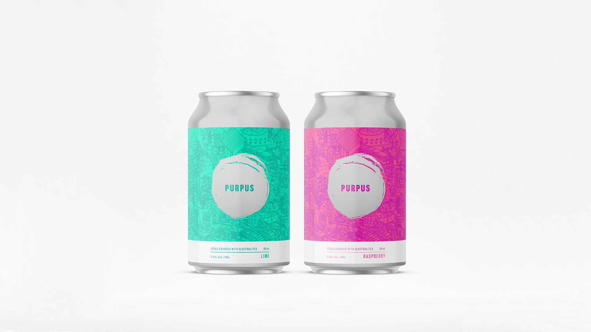
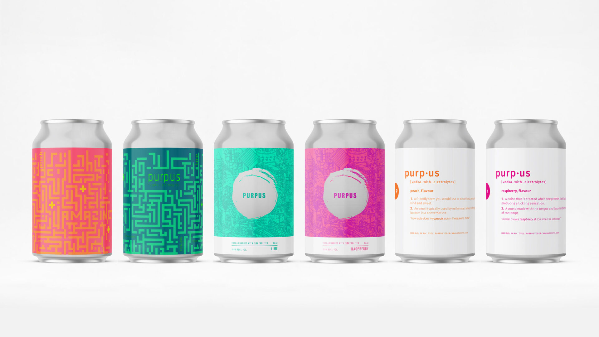
Three ideas were presented to highlight the flavours and the addition of electrolytes to this new local elixir coming to the market.
Three ideas were presented to highlight the flavours and the addition of electrolytes to this new local elixir coming to the market.
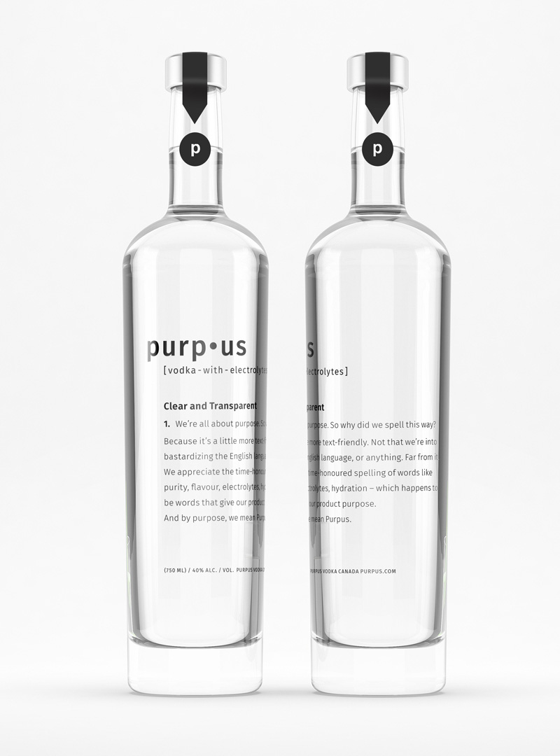
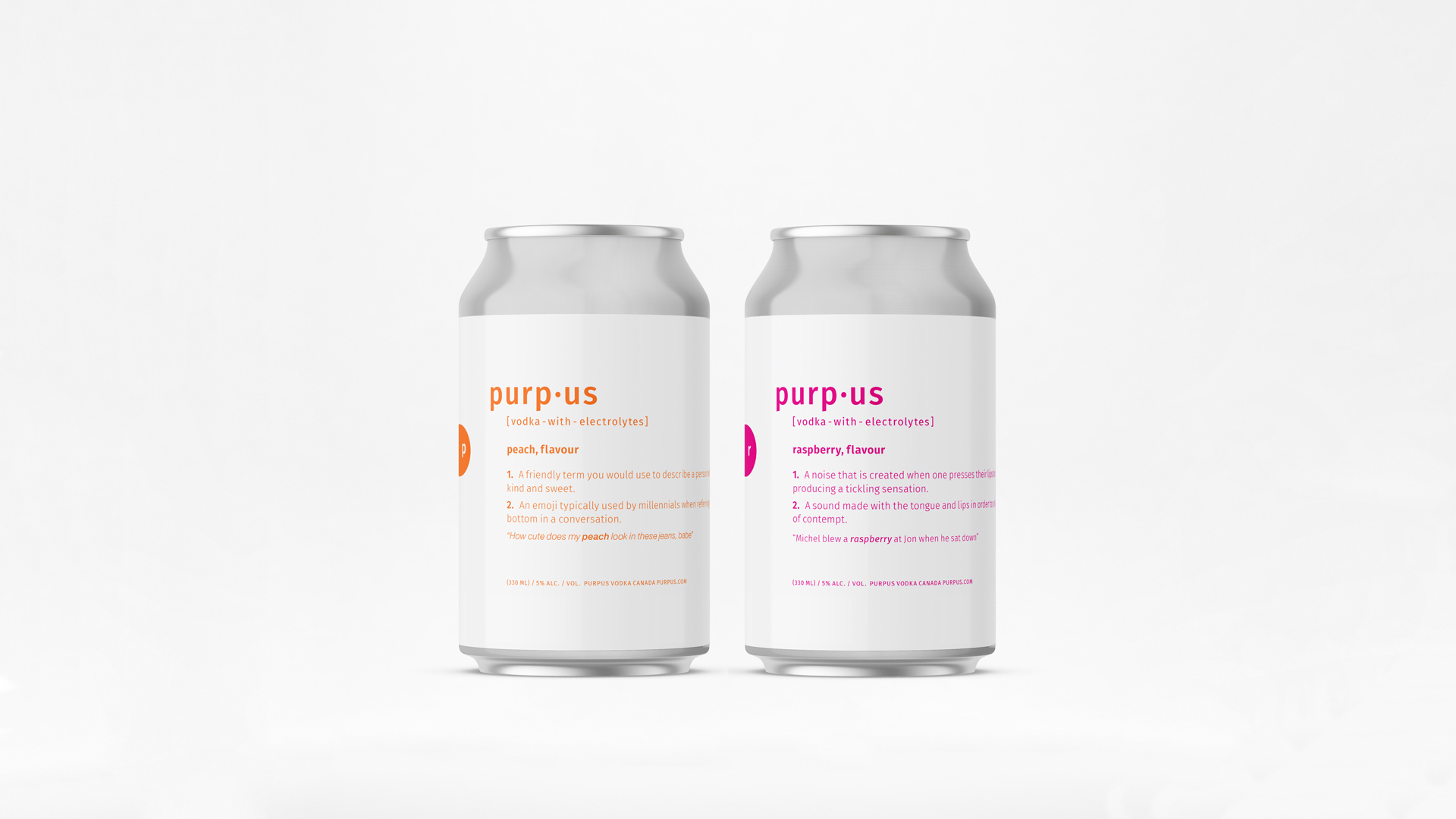
Concept 1.
Using a definition look we embraced the modern spelling of the brand.
The copy reads: We’re all about purpose. So why did we spell it incorrectly? Well, if we’re going to be honest, purpose was already trademarked. So Purpus was the next best route. And as we’ve come to learn, a little more text-friendly. Not that we’re into bastardizing the English language, or anything. Far from it. We appreciate the time-honoured spelling of words like purity, flavour, electrolytes, hydration – which happens to be words that give our product purpose. And by purpose, we mean Purpus.
Creative DIrection
Package Design
Copywriting – Sebastien Wilcox
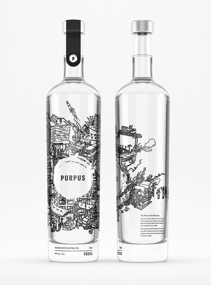
Concept 2.
Makes it clear that with Purpus your tomorrow is going to be living for tomorrow just as passionately as you’ll be living for tonight.